
5: January
Comparing your station’s precipitation to stations in different regions using qualitative data
Purpose
Building on last month’s comparisons of data from stations in the same region, this activity has students make sense of differences in precipitation across regions by comparing their own station’s fall data (meteorological seasonal total) with that of other stations located in different regions, and exploring differences in these locations.

Review last month’s graph and data sheets where students compared their fall totals for their school and another station in the same region. Discuss the value of additional qualitative notes for comparing data between stations. Then, without disclosing the stations’ location, provide students with Condition Monitoring Reports from fall data for a station in a region outside of their own. Using what they know about their own station, and taking into consideration the qualitative data, have students make claims about where in the US the other station may be located and in what region. Before reviewing the geographic location of the other station, ask students to record reasons why their data may differ from the other stations’ data. 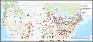
Using the Interactive Map on CoCoRaHS.org of the United States and the NOAA US Climate Regions Map, locate the other station, noting the different regions. Have students compare the stations in different regions across quantitative data sources (i.e., Summary Precipitation Report, data recording sheets) and qualitative data sources (i.e., data recording sheets, Condition Monitoring Reports).
Standards + Practices
Science
DCI: ESS2.C The Roles of Water in Earth’s Surface Processes
ESS2.D Weather and Climate
CCC: Cause and Effect
SP4: Analyzing and interpreting data
Students will be analyzing and interpreting data from their station and another station in a different region of the US. See Narrative and Science Content Supports.
SP5: Using Mathematics and Computational Thinking
Students will be using mathematics and computational thinking as they analyze and interpret the data from the Station Precipitation Summary Reports for stations in different regions. See Narrative and Math/Science Content Supports.
Mathematics
MP1: Make sense of problems and persevere in solving them
MP2: Reason abstractly and quantitatively
MP3: Construct viable arguments and critique the reasoning of others.
MP4: Model with mathematics
MP5: Use appropriate tools strategically
MP6: Attend to Precision
Resources + Supports

Ms. Clark’s Class Uses Qualitative Notes to Discern Differences in Precipitation Across Regions
Last month, Ms. Clark’s students identified patterns in precipitation data within their region, and this month she’d like to continue the discussion comparing with a station in a different region. She is aware of many strategies for uncovering students’ thinking, but in this case, she decides to spend a class period having students make and discuss scientific claims about where in the country the other station is located, and in what region, based on precipitation totals and qualitative data.
Ms. Clark reviews the data collection recording sheet they have been using all year, specifically pointing out the “notes” column on the far right hand side. She asks students, “What type of information can the notes column tell us about our data?” Students share that the notes column elaborates on the numerical data highlighting things like the reasons for zeroes, multi-day reports, and other significant weather details such as if there was a storm that week or no rain for an extended time. Ms. Clark shares that other stations record this same type of qualitative, or descriptive data, through the use of Condition Monitoring Reports on the CoCoRaHS website. Ms. Clark shares a few examples of Condition Monitoring Reports from the fall submitted by a nearby station, AZ-NV-42.

As students discuss the mystery station’s data, Ms. Clark records their claims on the chart and asks them to consider where in the US, and in what region, they believe this other station may be and why. Students discuss and share thoughts such as, “I think this station is in the midwest somewhere where there is a lot of farming,” “I think this station probably had more rain than we did this fall because they mention that their crops were very wet.” She then shares the other station’s number (WI-LN-2) and shows the students a map with this station circled.
Students compare this map with the NOAA US Climate Regions Map and comment that the station is in the Upper Midwest Region. Ms. Clark then has students pull up the Station Precipitation Summary Report for their station and the two other stations and encourages students to examine the data carefully while also comparing the qualitative notes provided in the Condition Monitoring Summary Report (see Participatory Science Support and Science/Literacy Supports below) to consider variations in fall precipitation data for each of the three stations.

As students discuss the qualitative data in pairs, Ms. Clark begins a list of students’ claims on the front board, including “very little rainfall in fall,” “mildly dry climate,” and “vegetation and wildlife changing throughout the season.”
To show differences between regions, Ms. Clark begins by asking students what region of the US their school is located in. Students share some guesses but do not name the correct region. Ms. Clark opens the NOAA US Climate Regions Map page on the smartboard and asks the question again. Students now recognize that their school is located in the Southwest region of the US. Ms. Clark then shares that they will be comparing their qualitative data (and the data from the other local station) with data from a station in another region of the US. She shares the following data with students, but does not share where in the US the station is located.


Condition Monitoring Reports & Summary Charts
Anyone can enter a condition monitoring report on CoCoRaHS.org. Click on “My Data” at the top of the screen, and then click on “Condition Monitoring Report” under “Enter My New Reports” on the left hand side of the screen. Condition Monitoring Reports report the changing on-the-ground conditions that observers note weekly, biweekly, or monthly at their station. The conditions noted are related to precipitation or lack thereof and include the date, a condition scale bar (from severely dry to severely wet), a written description, and a selection from condition monitoring categories. The condition monitoring reports serve as qualitative data, which support the quantitative data captured daily in rain gauge reports.
To access completed Condition Monitoring Reports for a specific station, state, and/or county (Note: Not all stations choose to complete these reports; therefore, even though a station records precipitation data, they may not have condition monitoring reports to view.):
- Click on View Data.
- Under CoCoRaHS Data Reports, click on Condition Monitoring Reports.
- Fill in the station number or location (including country, state, and/or county) and the date range of observations. Click on Search.
- All reports filed at that location during that time period are shared in the report.
- Click on the icon under “view” on the right hand side of the report to view singular station reports.


To view the Condition Monitoring via the Interactive Map:
- Click on “Condition” at the top of the map.
- Fill in the information for the location and dates you would like to view. Click Search.
To view Condition Monitoring Summary Charts (Graphs and Maps of data):
- Click on View Data.
- Click on Condition Monitoring Summary Charts under CoCoRaHS Data Reports.
- Narrow down your search by country and state or by Station Number/Name. Click Generate Report.
- Scroll down the page to view various Summary Charts including Condition Monitoring Report Scale Bar Value Frequency Distribution, Condition Monitoring Report Scale Bar Value as Percentage of Total, Weekly Condition Monitoring, and more.


To View a Condition Monitoring Summary via the Interactive Map:
- Click on View Data.
- Click on Condition Monitoring Summary Charts under CoCoRaHS Data Reports.
- On the top of the page, click on CM Maps. Search for your station, state, and/or region on the map and use the sliding scale bar at the bottom of the map to choose your date range of observations. You can view the map as “street map” or “aerial imagery.”

Using Qualitative Notes
As students interpret data from the Condition Monitoring Reports and Summary Charts, encourage them to refer back to the qualitative notes they took while collecting data in the data recording sheets throughout the year (far right “notes” column of the data recording sheet).
Guide students to consider what information is included in the Condition Monitoring Reports and the information they are including in the notes section of their data recording sheet. Ask students what information they can begin including on their recording sheets in order to submit a condition monitoring report next week.
In addition, encourage students to compare the Station Precipitation Summary Charts with their data recording sheets for September, October, and November. For days on the chart that show no precipitation, ask students to refer to their notes to determine whether they measured zero, or were missing data for that day.

Analyzing and Interpreting Data
As students compare their fall data with other stations’ data in different regions, there is an opportunity for students to analyze and interpret the data within each station’s data charts. Instead of graphing the data on a bar chart themselves, students can use the Condition Monitoring Summary Charts on CoCoRaHS.org to analyze and interpret a variety of ways to represent a station’s precipitation data.
Provide time for the students to review the various tables and choose one that they want to use to draw conclusions about the precipitation in the stations represented.
Questions for students to consider when interpreting data:
- What do I notice about how these data are displayed?
- What information can be found in the headings of the data sheet, in the graph title, or on the x- and y-axis of the graph?
- What patterns do I see in the data?
- Are there data that stand out? What are possible explanations for those points?
- Are there data missing?
- Which measure of center would best describe these data (mean, median, or mode)?
- What is the shape of the bar graph of the data? How does the shape of your station’s data compare to the other station’s?
- What can I infer based on these data?
- What predictions could I make based on these data?
- What questions do I have, or what do I still need to figure out? What data would help me answer those questions?

Making Sense of Trends in Weather Data
Why is it important to make sense of trends in weather data?
As students begin to examine more data (e.g., more months, more regions, more seasons), and use more tools to view data in a variety of ways, they may start noticing trends in the data. Scientists use these trends to make predictions about water levels, amounts of rainfall/snowfall, drought conditions, and more.
- Meteorologists use trends in data to make and verify their forecasts.
- Hydrologists use trends in data to examine water levels in streams, rivers, and reservoirs.
- Water Management facilities use trends in data to manage the projected water demands of their customers.
- Agribusiness monitors trends in weather data for crop development and yield.
- Climatologists examine year-to-year precipitation trends as they review drought, severe weather, and overall climate models.
- Trends in weather are valuable for recreation enthusiasts, from fishermen to kayakers to ski resorts, golf courses, and more.
How can I help my students make sense of the trends in our weather data?
Below are suggestions for students to communicate their sensemaking of trends in weather data for one of the scientists or others listed above (or another from the CoCoRaHS website: Who Uses CoCoRaHS Observations?).
- Have students share one trend they have noticed in their data. Example: I see it has rained for four days straight, no less than 0.65 inches each day. That is a lot of rain in such a short amount of time. The ground is saturated.
- Ask students to choose one of the scientists or others (recreation facilities, water management facility, etc.) that use the CoCoRaHS data observations. Example: I think a soccer field manager would be very interested in this trend because if it continues to rain, they may not get many soccer games in, which would affect their overall business. Also, if the teams do play, they will be running into a lot of puddles, mud, and wet ground where the ball won’t roll well, players might get injured, or the fields might get damaged.
- Have students write a short podcast or weather forecast script to share with scientists or their classmates. Example podcast script: Good morning, and welcome to your daily weather trend report. Today we have disappointing news for all of our soccer fans out there. Unfortunately, with four days straight of rain and no end in sight…unless you can play in rain boots or umbrellas on your head…it looks like you might not get back out onto the soccer fields this week! The overall forecast indicates there might be some clearing in the skies, but our weather trend report suggests that due to the large amount of rain we’ve had for four days straight, the ground may be supersaturated for some time. If your team does decide to head on out there, be careful! Be prepared for kicking up more water than your ball, and know that your ball won’t roll for long after landing, so you will have to adjust your kick. You might be better off playing traveling soccer down in some fields in the Coastal Plains region of the state where they haven’t seen a drop of rain for a month! That’s all for our weather trends report today. Let’s hope there’s a dry spell in our forecast so you can get out to play ball without getting soaked or covered in mud!
 Think about what has gone well for your students in December and January and what areas they could use additional support. In February, students will consider data from paired stations to learn more about the rain shadow effect using Water Year Summary Reports. Spend time familiarizing yourself with the Water Year Summary Reports tool as you prepare to work with students. Refer to the PS support in February to start selecting paired stations that you want to include as options for your students to work with.