
2: October
Precipitation data over one month for your school
Purpose
In August and September students were introduced to rain gauge data collection protocols. As we move to data analysis and sense making, this month’s activity asks students to make sense of daily changes and patterns in a month-long dataset. Students graph quantitative data and examine their qualitative observations to discern patterns.

Lead students in creating a class bar graph of the daily precipitation measurements they collected during September. As a class, make decisions about the components of the graph (e.g., title, axes labels, scale) and use these decisions to create a large class graph (e.g., on chart paper) that all students will use to plot their points. Students may also work simultaneously on creating their own graph. If graphing as a class, assign students a day of the month that they will be responsible for plotting on the graph. After all students have plotted their point on the class graph, allow students time to examine the graphed September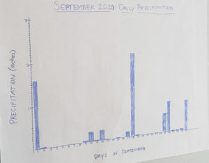 data and share with a partner. Facilitate a class discussion about daily changes and any patterns that emerge from the data. If any dates stand out (e.g., a day with a considerable amount of rainfall, stretches with no rain), encourage students to review their class data sheet or the CoCoRaHS map on a particular date for additional information to facilitate sensemaking. Introduce students to the Data Explorer dashboard for their station and allow time for students to explore and highlight the precipitation calendar and precipitation summary features (see PS: Data Explorer Tool support). Provide time for students to summarize their findings about precipitation in September..
Standards + Practices
Science
DCI: ESS2.C The Roles of Water in Earth’s Surface Processes
CCC: Cause and Effect
SP4: Analyzing and interpreting data
Students will graph precipitation data for one month to look for patterns and make sense of changes in day-to-day precipitation. After graphing the data, students use their qualitative observation notes to make sense of any values that stand out. Students will also access the Data Explorer tool to view another representation of these data.
Mathematics
MP4: Model with mathematics
MP6: Attending to precision
Resources + Supports

Ms. Clark’s Class Graphs Last Month’s Precipitation Data
Plotting each day’s data point on a graph during this activity will help Ms. Clark’s students see patterns in these data and also provide an opportunity to review graphing skills. Knowing that students will be creating their own graphs in the future, Ms. Clark decides to create the class graph on chart paper (with gridlines) that can be displayed as an example in the classroom for students to reference throughout the year.
In her experience teaching, she has noticed that students often find it difficult to decide what to put on the x- versus y-axis. Ms. Clark uses students’ experience collecting precipitation data to illustrate the difference between what belongs on the x-axis (independent variable–in this case, the date) versus y-axis (dependent variable–in this case, the amount of precipitation). With the axes drawn but unlabeled, she asks the class, “What would you say if someone asked you how much it rained?” A student replies, “It would depend on which day they were asking about.” Ms. Clark writes on the chart paper “The amount of precipitation depends on when (what day/what month),” and explains to students how that makes precipitation the dependent variable, which goes on the y-axis. Ms. Clark labels the y-axis “Precipitation” and asks students what the least possible amount of precipitation is, to which they reply “0,” and Ms. Clark labels 0 on the graph. Ms. Clark asks all students to share with a partner the greatest amount they saw on a day in September. The class determines 2.25 inches was the greatest amount recorded. Ms. Clark explains that 2.25 is more than 2, but less than 3, and suggests that they end their y-axis at 3. Although Ms. Clark already considered how to label portions of the scale ahead of class, she thinks aloud as she models her process for determining the scale, ultimately determining that each minor grid line would be 0.05. Once the y-axis is labeled with values, Ms. Clark asks students what those values represent and then adds the unit “(inches)” to her axis label. Helping students recognize the date as the independent variable, Ms. Clark labels the x-axis “Days in September” and labels the x-axis 1-30.
Ms. Clark is concerned that her students will find it difficult to plot decimal values, as these are less familiar than whole numbers at this point in the year. For this reason, and because there was no rainfall on several days, Ms. Clark decides to put her students in pairs and assigns each pair one date when they recorded precipitation greater than zero. After plotting multiple zeroes, and modeling for students how to plot another point greater than zero on the class graph, Ms. Clark then asks a couple pairs at a time to mark their point on the graph. Once the graph is complete, Ms. Clark shares that they will keep it in their classroom and reminds students, “We need to title our graph. Otherwise, we may not remember what we’re looking at, or others who come into our classroom may not know.” As a class, they decide to title the graph, “September 2020: Daily Precipitation.”

Graph Types
Marking the top of the bar, rather than shading bars, facilitates class collaboration in graphing by allowing students to more quickly plot their point on the graph. If you plan to display this graph in your classroom long term, consider having students go back and shade in to create bars
when time allows. Throughout these engagements, students will use a bar chart, as it is an appropriate representation of these data. A line graph with connected data points would represent change over time. Although precipitation measurements change daily, each day’s measurement is independent. A line graph is appropriate for accumulated precipitation (see Data Explorer Tool support below).
Graphing Tips
- For “trace” amounts, students can write a “T” on the x-axis, instead of drawing a bar.
- If graphing an amount from a multi-day report, students can add an asterisk to the top of the bar to signal that it’s a multi-day reading.
- Students can represent “0 inches” with a line on the x-axis, opposed to missing data, which would be left blank.

Data Explorer Tool
Using the Station Data Explorer, referred to as the “Dex,” students can access a dashboard for their station (or any other CoCoRaHS station), which offers various data displays.
Have students view the “precipitation calendar” for September and make comparisons with how data are displayed on their graph. Engage students in discussion about the affordances and limitations of each display (e.g., the bar graph shows the exact amount of precipitation, the calendar is automatically generated).
Sample Precipitation Calendar

Students can also use the precipitation summary tool to generate a graph for the same time period and compare with their graph. The second graph below should most closely align with their graph, and they can see whether they decided upon the same scale. Students can also examine how bars are used to represent the daily precipitation and a line graph for the accumulated precipitation and see the relationship between the two.

Making Sense of Decimals
Incorporating other representations (e.g., hundreds grids, base ten blocks) or everyday uses (e.g., money) may help students make sense of decimal values.

Data Collection
Common Mistakes
Meniscus:
- Reading from the top of the meniscus instead of the bottom
Reading and Recording Decimal Values:
- Rounding to the nearest tenth of an inch instead of reading to the closest hundredth of an inch.
- Recording values in between two different tenths of an inch as a combination of those values.
- For example, recording 0.53” as either 0.56” or 0.65” because 0.53” falls in between 0.5” and 0.6”
- Placement of decimal in a value.
- For example, recording 0.53” as 5.3” or 53”.
- Directionality in reading the rain gauge.
- For example, recording 0.53” as 0.67” because reading rain gauge from the top down and adding hundredth tick marks when going down.

Meteorologists & Local Connections
To build on student understanding of the purpose of this month’s engagement, learning what a meteorologist’s work entails and how they use daily weather patterns to make weather predictions is important. A meteorologist, or weather forecaster, is a scientist that uses observational data to make predictions about the daily weather. Meteorologists use the data gathered on the CoCoRaHS website to help confirm or refute predictions they have made about weather patterns. Therefore, students’ consistent contributions to the dataset are very important.
In addition, to highlight diversity and representation in the field of meteorology, share the following YouTube video with your students: The Importance of Black Meteorologists
Connecting with and finding local scientific support would be an authentic way to help students make connections with scientists that use CoCoRaHS data. Be intentional about finding connections to diverse scientists your students can relate to as you consider contacting either of the following local or national resources to aid students with their research:
- Connect with your State Climate Office here: https://stateclimate.org/state_programs/.
- Connect with a meteorologist through a local chapter of the American Meteorological Society here: https://chapters.ametsoc.org/
- Connect with a local TV weather reporter through a Google search.

Writing Prompts
The following writing prompts can be used for helping students make sense of patterns in their data:
1. What patterns do you notice about the amount of precipitation throughout September? Explain your thinking using words and drawings, diagrams, or other representations.
Teacher note: Potential precipitation patterns to look for in student work
- Frequency of days with and without precipitation
- Position (there was always at least two days of no precipitation in between precipitation events) of days with and without precipitation.
- Attention to the varying amounts of precipitation throughout the month.
- Attention to varying amounts of precipitation over consecutive days with reported precipitation (i.e. if amounts tend to increase or decrease when consecutive days of precipitation are reported or if consecutive days show an increase and decrease throughout the span).
- Notes regarding the range of precipitation amounts (i.e. a student may note that most precipitation days had between 0.12” and 0.24” of rainfall).
- Attention to weekends vs. weekdays due to data collection methods (weekends may be multi-day reports).
2. How do observational (qualitative) notes help explain the September precipitation graph? Explain using your notes from September and the class graph or the precipitation calendar from CoCoRaHS.
 It would be helpful to familiarize yourself with the Active Stations map (within the Interactive Maps options; see next month’s website navigation support for help in accessing this map), as well as the Precipitation Map and the “List Stations” report on the CoCoRaHS website. Each of these will be integral to student activities in the next month’s comparing your own data with other stations’ data. Supports are provided in the November activity to assist you in reviewing these sections of the website.