Standards + Practices

Science Standards:
ESS.5.1.1 Analyze and interpret data to compare daily and seasonal changes in weather conditions and patterns
ESS.5.1.2 Analyze and interpret weather data to explain current and upcoming weather conditions in a given location.
ESS.5.1.3 Construct an explanation to summarize the ocean’s influences on weather and climate in North Carolina
ESS.5.1.4 Use models to explain how the sun’s energy drives the processes of the water cycle
Science Practices
SP2: Developing and using models
SP5: Using mathematics and computational thinking
Math Standards:
NC.5.MD.2 Represent and interpret data: Collect data by asking a question that yields data that changes over time.
NC.5.NBT.3 Read, write, and compare decimals to thousandths.
Math Practices
MP5: Use appropriate tools strategically
Resources + Supports

Meteorological Seasons
Remember, students will be working with data for meteorological seasons in the same way as meteorologists and climatologists.
- Summer: June, July, and August
- Fall: September, October, and November
- Winter: December, January, and February
- Spring: March, April, and May.
Refer back to the Extensions Support in December for more information regarding meteorological seasons.

Ms. Clark’s Class Uses Computational Tools to Examine Seasonal Patterns
Ms. Clark recognizes that although CoCoRaHS makes a lot of data available to students, they might be discouraged by the number of calculations they would have to do to make sense of the data. Ms. Clark wants to demonstrate the affordances of using computational tools to organize, represent, and analyze large amounts of data. She decides to begin instruction as though students will be manually working with large data sets. When students begin to raise questions about the challenges of managing such a large number of values (i.e., a season’s worth of daily precipitation records), Ms. Clark introduces Google Sheets as a tool for students’ use.
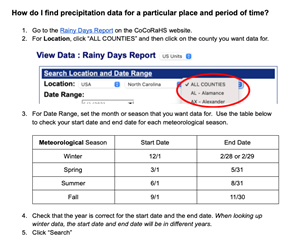
After grouping students into teams of 4, Ms. Clark assigns each team to a different county in the region. Within each county-specific team, the students assign the four seasons among themselves. Ms. Clark demonstrates how to access a season’s worth of data for a particular county using the CoCoRaHS Rainy Day report, explaining to the class, “For example, if you wanted to look at precipitation data for summer (June, July, August) in Wake County, you would put in 6/1/2020 and 8/31/2020, and select Wake.” Then, to find the total average precipitation across all stations in Wake County, you would add the values in this first column. One student exclaims, “We have to add ALL of those?!” Another chimes in, “That’s going to take forever!” Ms.Clark then says, “Actually, we are going to use a tool to help us,” to which one student replies, “Oh, right, we can use calculators.” The student from earlier reiterates, “That’s still going to take forever!” Ms. Clark assures students that this tool will help in the same way that a calculator does but that they will also be able to keep track of what values are being added.
Ms Clark wants her students to understand what is happening behind the scenes in the Google Sheet Template template, so before having students use the template to sum 90+ values, she models using three values she knows they can add in their head. Once they see how they can use Google Sheets to add a column of numbers, Ms. Clark gauges that they’re ready to move on to the data analysis for the CoCoRaHS data. Ms. Clark demonstrates how to use the Google Sheet Template to calculate totals by copying and pasting the data from CoCoRaHS. Ms. Clark has created a copy of the template for each team to enter the data that they find on the CoCoRaHS Rainy Day report.
Scaffolding Students’ Use of Computational Tools
If this is students’ first experience using a spreadsheet, providing a template that already includes a formula that sums the values will support their early work with computational tools. To build their understanding, it is important to show the formula and discuss how it communicates which values to add.
Discussing the Template With Students
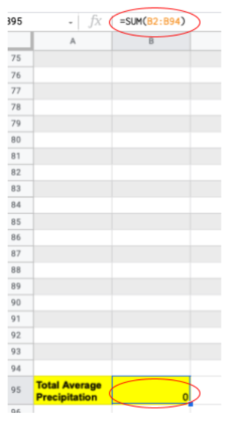
1. Click on the cell that displays “0” for Total Average Precipitation.
2. Show students where =SUM(B2:B94) appears.
- What is meant by “sum”? Where else have you heard that word? (It may be necessary to distinguish between “some” and “sum.”)
- What do you think the “B” represents?
- What do you think the “2” and “94” represent?
3. Explain how that formula tells the computer what to do. Demonstrate how the template will automatically calculate the sum.
- What do you think will happen if I put numbers in some of these cells?
- Where should I type the numbers?
- What do you notice is happening to the cell with the total?
- What happens if I delete these numbers and try again?
4. Demonstrate how the template will only add values in the designated cells by typing values in columns other than B.
5. Then, use the CoCoRaHS Rainy Day report to demonstrate how to create a seasonal report and copy the values into the spreadsheet, pointing out to students that the template has one sheet per season and one for the graph.
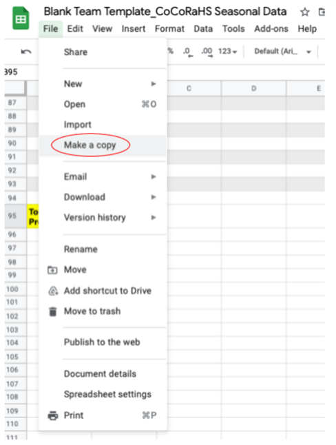
Copying the Template
When making copies, consider renaming each copy to include the names of the assigned counties.

Accessing Historical Data in CoCoRaHS
Daily county-level averages are available through the Rainy Days Report.
Students should select the county they’re focused on from the “ALL COUNTIES” drop-down menu.
Then, students should change the dates accordingly to obtain data for each season (e.g., 6/1/21-8/31/21 for meteorological summer).
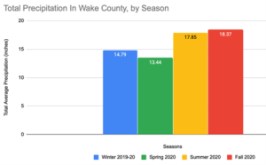
Copying these values and pasting them into a spreadsheet will allow students to calculate each seasonal total by combining the daily county averages and generate a graph to compare the four seasonal totals.

Digital Literacy Skills
Loewus, L. (2016, November 8). What Is Digital Literacy? Education Week. https://www.edweek.org/teaching-learning/what-is-digital-literacy/2016/11
- Finding and consuming digital content
- Students understand how data tables and graphs are labeled and organized
- Students can retrieve relevant information from different parts of a data table
- Students can manipulate data by sorting and filtering for relevant information with support
- Students ask questions to identify relevant information to their goals
- Students can identify a starting and ending point of an investigation and ask questions to guide themselves between these points
- Students recognize patterns in data
- Creating digital content
- Using formulas to compute sums, averages, and/or differences of various data
- Students recognize how variables in data tables can be selected and used to create graphs
- Students understand the relationship between how data tables are constructed and how information from data tables is displayed on graphs
- Students can correctly label the x-axis and y-axis of a graph
- Students can identify reasonable axes intervals when graphing data
- Communicating and sharing digital content
- Students communicate information in a way that contributes to the intended meaning of investigation goals
- Students understand the importance of fully interpreting their work before sharing it with others

Seasonal Weather Patterns
The fifth grade NC weather standard states that students will understand weather patterns and phenomena, making connections to weather in a particular place and time and compare seasonal changes in weather conditions. As students begin to find patterns in seasonal data within their region, it would be helpful to compare their findings to their understanding of seasonal patterns found in different locations. Ask students to consider: What seasonal patterns are you finding in our data? Is our fall data different from our winter data thus far? Why might this be? How does location affect the seasonal weather patterns we are finding in our data? Does our location within the Northern Hemisphere account for seasonal differences in our data? How do you know?
This activity represents a good opportunity to review the difference between weather and climate. As students review patterns in seasonal data, help students realize that they are looking at seasonal data for one instance of that particular season making their data seasonal weather data, not climate data. Refer back to the August/September Science support on weather and climate to review as necessary.

Finding New Answers
In citizen science projects, the outcomes are unknown, because scientists are using participant data to answer questions. Participating in these projects enables students to authentically contribute to scientific research. When students encounter data points and weather events that are unexpected, acknowledging that change and finding new answers are foundational to real science!

Connecting the Water Cycle to Seasonal Precipitation
Below is a sample of how students may respond to questions around the science content standard ESS.5.1.4.
ESS.5.1 How might the water cycle be connected to seasonal precipitation amounts?
I know that the sun makes the water cycle happen. In the summer, there is more sunlight than in other seasons. This makes me think that the reason the summer precipitation amounts are higher for the mountain and piedmont regions than other seasons is because more sunlight means more evaporation which leads to more precipitation. I’m not sure why that wouldn’t be the same in the coastal region because the coastal region also has more hours of sunlight in the summer compared to other seasons.
 Now that students have examined data patterns across seasons, next month students will make sense of regional precipitation by comparing precipitation totals for one season across regions. Students may overgeneralize when looking at their county’s data and will benefit from understanding how representative their county is of an entire region. Consider where your station is in your county and other stations that represent various other locations within your county (refer back to November to review how representativeness is addressed, averaging multiple stations in a county).


